How to Draw and Read a Box Plot
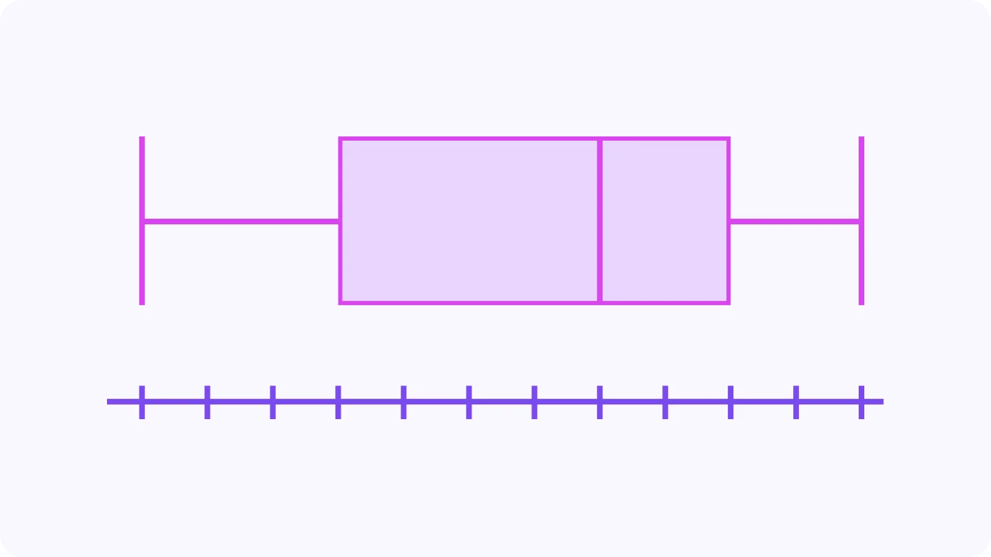
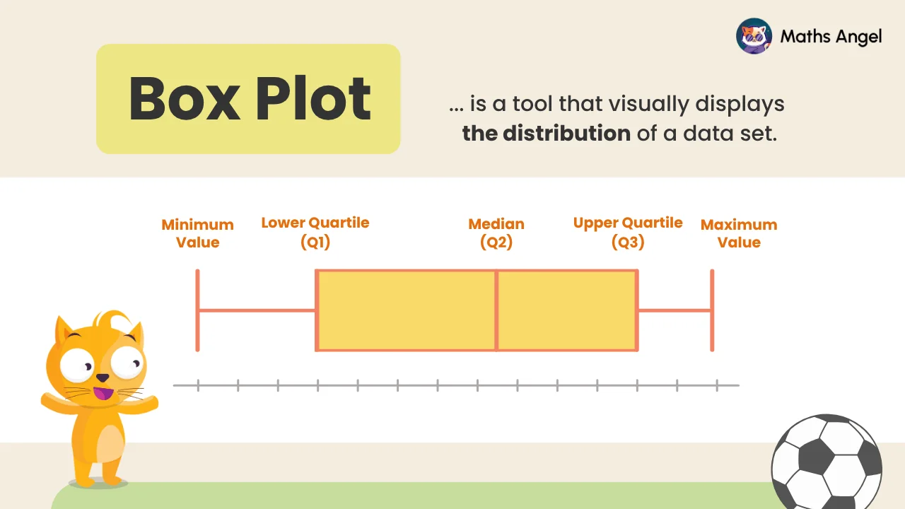
A box plot shows how a data set is spread out using five values: the minimum, Q1, median, Q3, and maximum. The box runs from Q1 to Q3, with a line at the median. The interquartile range (IQR) is Q3 − Q1, the middle 50%.
Video Lesson
Watch and learn the basics
🎬 Did this video explain it clearly?
Flashcards
Review key concepts visually
%20Box%20Plots.webp)
%20Creating%20Box%20Plot.webp)
%20Interpreting%20Box%20Plot.webp)
What Is a Box Plot?
- A box plot shows the distribution of a data set.
- It highlights the spread and middle of the data clearly.
Creating a Box Plot
- Find the minimum, Q1, median (Q2), Q3, and maximum values.
- Draw a box from Q1 to Q3 with a line at the median.
Interpreting a Box Plot
- The interquartile range (IQR) is Q3 − Q1 and shows the middle .
- The range is maximum − minimum and shows the full spread.
Practice Questions
Test your understanding
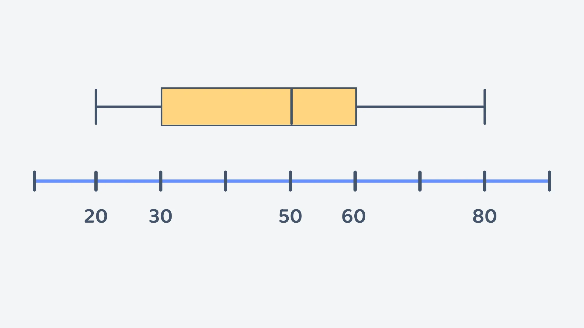
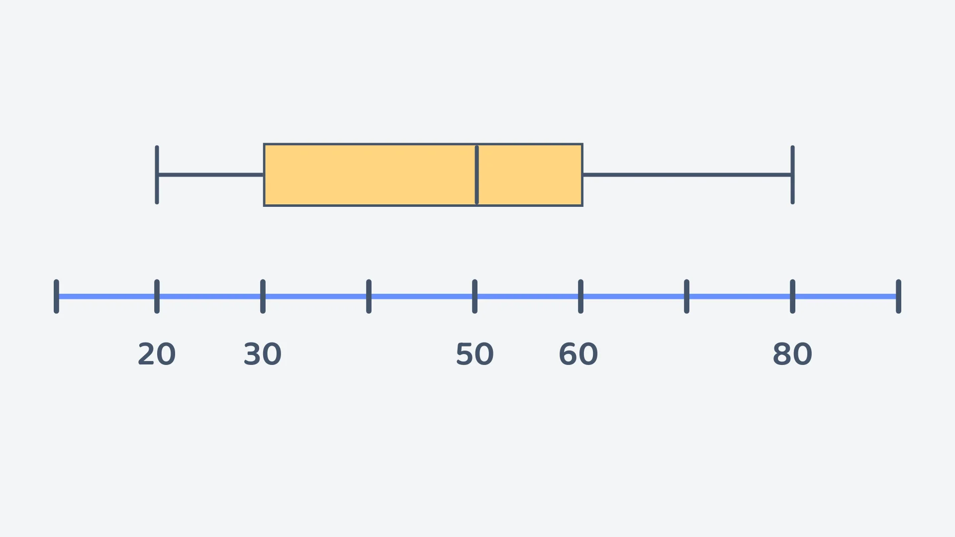
Consider the following boxplot. What is the range represented by the boxplot?
Correct! 🎉 +10 pointsCorrect! 🎉 Worth 10 XPNot quite right
The ends of the whiskers show the smallest and largest values: the left whisker ends at 20 and the right whisker ends at 80.
Range = largest − smallest = .
The box itself runs from 30 to 60; that gives the interquartile range of 30, not the range. Read the value at each whisker end from the scale rather than counting tick marks, and remember to subtract: the maximum on its own (80) is not the spread.
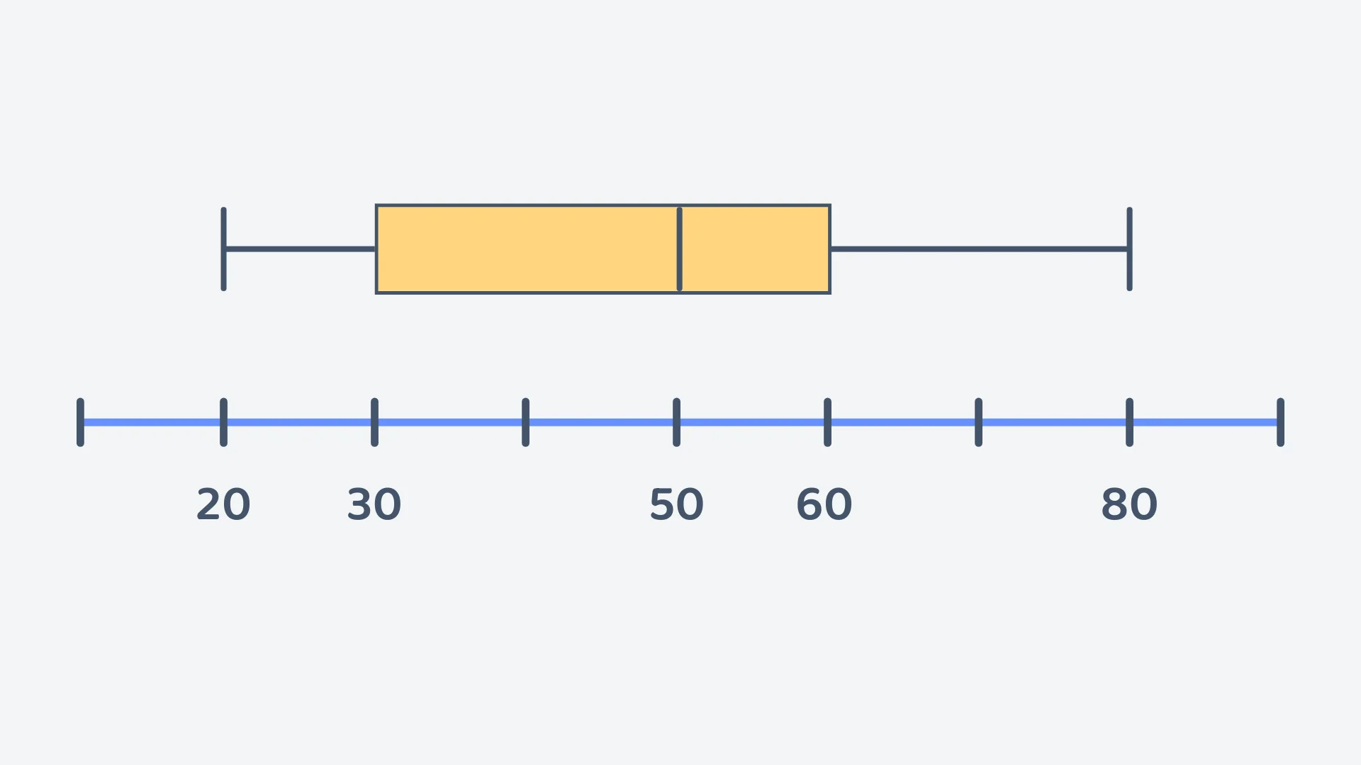
Consider the following boxplot. What is the interquartile range (IQR) represented by the boxplot?
Correct! 🎉 +10 pointsCorrect! 🎉 Worth 10 XPNot quite right
The two ends of the box are the quartiles: the lower quartile and the upper quartile .
IQR = .
Do not use the whiskers: is the full range. The line inside the box, at 50, is the median, not a quartile. And read the two quartile values off the scale rather than counting the tick marks across the box.
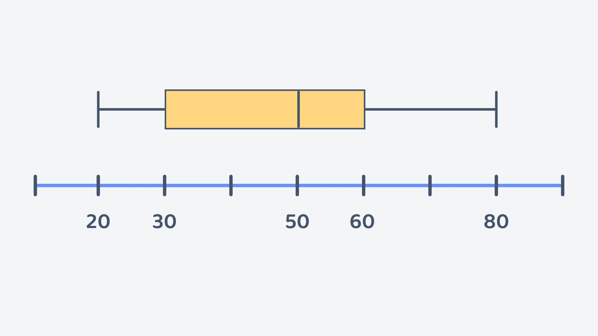
Consider the following box plot. What is the median represented by the box plot?
Correct! 🎉 +20 pointsCorrect! 🎉 Worth 20 XPNot quite right
The median is shown by the line drawn inside the box. The edges of the box are the quartiles, not the median.
That line sits directly above the 50 mark on the scale, so the median is 50.
The box runs from to , and the whiskers reach the smallest value, 20, and the largest, 80. Take care with the scale as well: the ticks are 10 apart, and the first tick is 10, not 0.
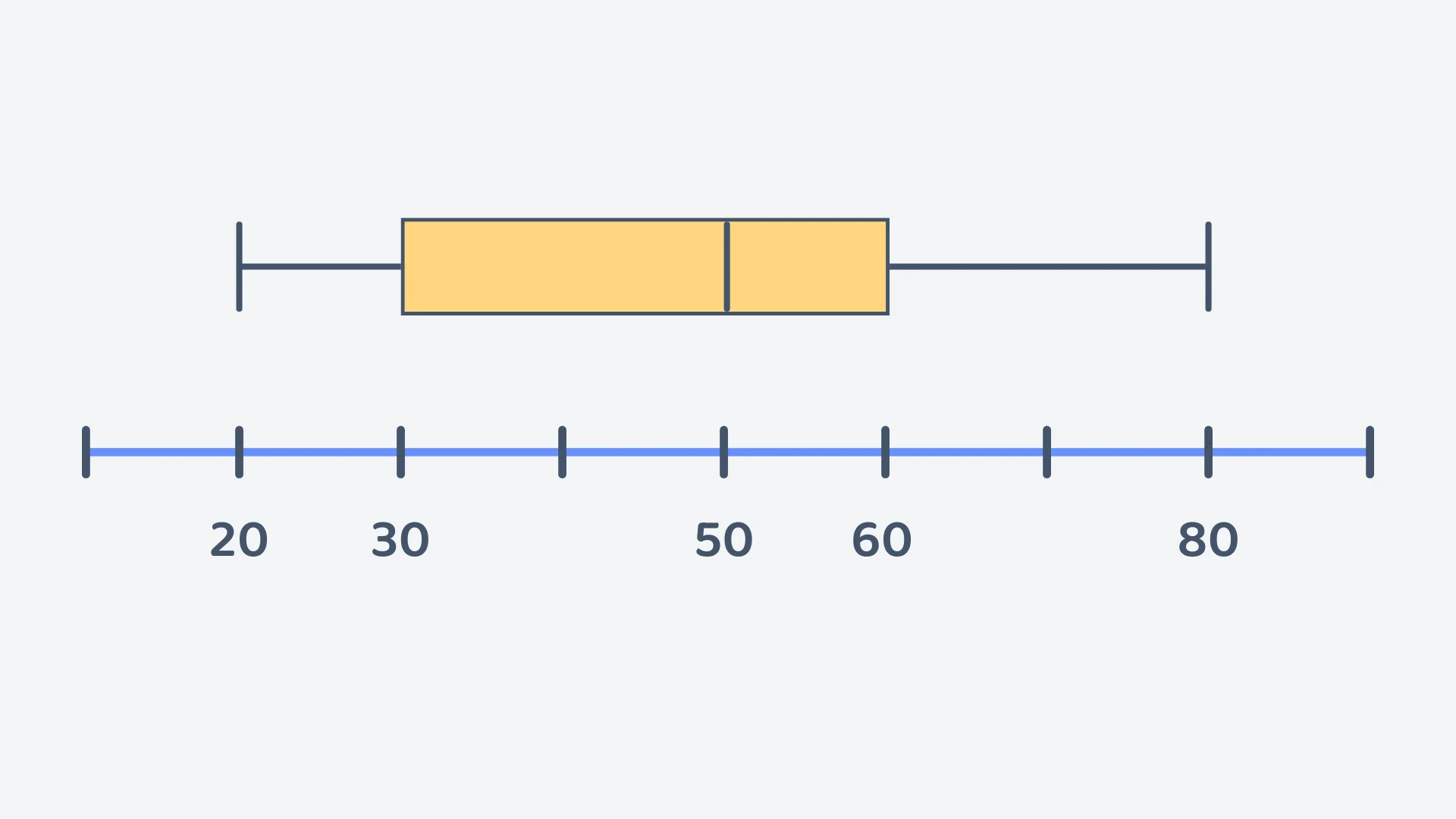
In the box plot, the middle of the data lies between which two values?
Correct! 🎉 +20 pointsCorrect! 🎉 Worth 20 XPNot quite right
The box itself shows the middle of the data: it runs from the lower quartile to the upper quartile .
Here the box starts at 30 and ends at 60, so the middle lies between 30 and 60.
The whisker ends, 20 and 80, are the minimum and maximum, and the line at 50 inside the box is the median.
What percentage of the data lies between (30) and the maximum value (80)?
Correct! 🎉 +20 pointsCorrect! 🎉 Worth 20 XPNot quite right
A box plot splits the data into four equal quarters, and each quarter holds of the values: minimum to , to the median, the median to , and to the maximum.
From (30) up to the maximum (80) covers three of those quarters, so the percentage is .
The sections are different lengths on the page, but each one still holds the same amount of data.
Consider the following dataset: 10, 20, 35, 40, 45, 70, 80. Which of the following box plots correctly represents this dataset?
Correct! 🎉 +30 pointsCorrect! 🎉 Worth 30 XPNot quite right
There are 7 values and they are already in order: 10, 20, 35, 40, 45, 70, 80.
The median is the middle (4th) value, so the median is 40.
The lower half, the three values below the median, is 10, 20, 35, so . The upper half is 45, 70, 80, so .
The smallest value is 10 and the largest is 80, so the box plot is: Min 10, 20, median 40, 70, Max 80. The box goes from to , not from the smallest value to the largest, and the four sections come out different widths. That is fine, as each still contains a quarter of the data.
Want to see the full working?
Interactive Activity
Drag the data points to understand how to read a Box Plot
Loading interactive widget...
Frequently asked questions
The questions students bump into most on this topic
A box plot, or box and whisker plot, shows how data is spread using five values: the minimum, the lower quartile Q1, the median, the upper quartile Q3 and the maximum. The box runs from Q1 to Q3 with a line at the median; the whiskers reach the minimum and maximum. In the video the five values are 1, 4, 8.5, 12 and 18.
Sort the data, find the median, then find the median of each half. With 10 values the median is the average of the 5th and 6th, 8.5, splitting the list into two halves of five. Q1 is the middle value of the lower half, 4, and Q3 the middle of the upper half, 12: the two ends of the box.
Find the five values first: sort the data, then take the minimum, Q1, the median, Q3 and the maximum. Draw a number line with a scale that covers them. Draw a box from Q1 to Q3 and a line inside it at the median, then draw a whisker from each end of the box out to the minimum and the maximum.
The interquartile range, or IQR, is the spread of the middle 50% of the data: the upper quartile minus the lower quartile, Q3 − Q1. For the exercise data, Q3 is 12 and Q1 is 4, so the IQR is 8 hours. A larger IQR means the middle half of the data is more spread out; a smaller one means it is more consistent.
Sort the data, find the median, find Q1 as the median of the lower half and Q3 as the median of the upper half, then subtract: IQR = Q3 − Q1. For 5, 6, 8, 8, 9, 9, 10, 10, 10, 12 the halves are 5, 6, 8, 8, 9 and 9, 10, 10, 10, 12, so Q1 = 8, Q3 = 10 and the IQR is 2.
The range uses the two ends, maximum minus minimum, so it covers the full spread: 18 − 1 = 17 hours. The interquartile range uses the two quartiles, Q3 − Q1, so it covers only the middle 50%: 12 − 4 = 8 hours. The IQR ignores the extreme values, which is why it is the better measure of consistency.
What's next?
Found this one hard? Go one step back first. Feeling confident? Carry on to the next lesson.