Introduction to Mapping
Mapping in maths links each input to one output, describing how two quantities relate. For example, time is mapped to speed, so each hour has a matching speed value. You can show a mapping using tables and graphs.
Video Lesson
Watch and learn the basics
🎬 Did this video explain it clearly?
Flashcards
Review key concepts visually
%20Mapping%20Definition%20and%20Example.webp)
%20Mapping%20Through%20Table%20and%20Graph.webp)
%20Mapping%20Example%20Types%20of%20Balls%20and%20Their%20Weight.webp)
What Is a Mapping?
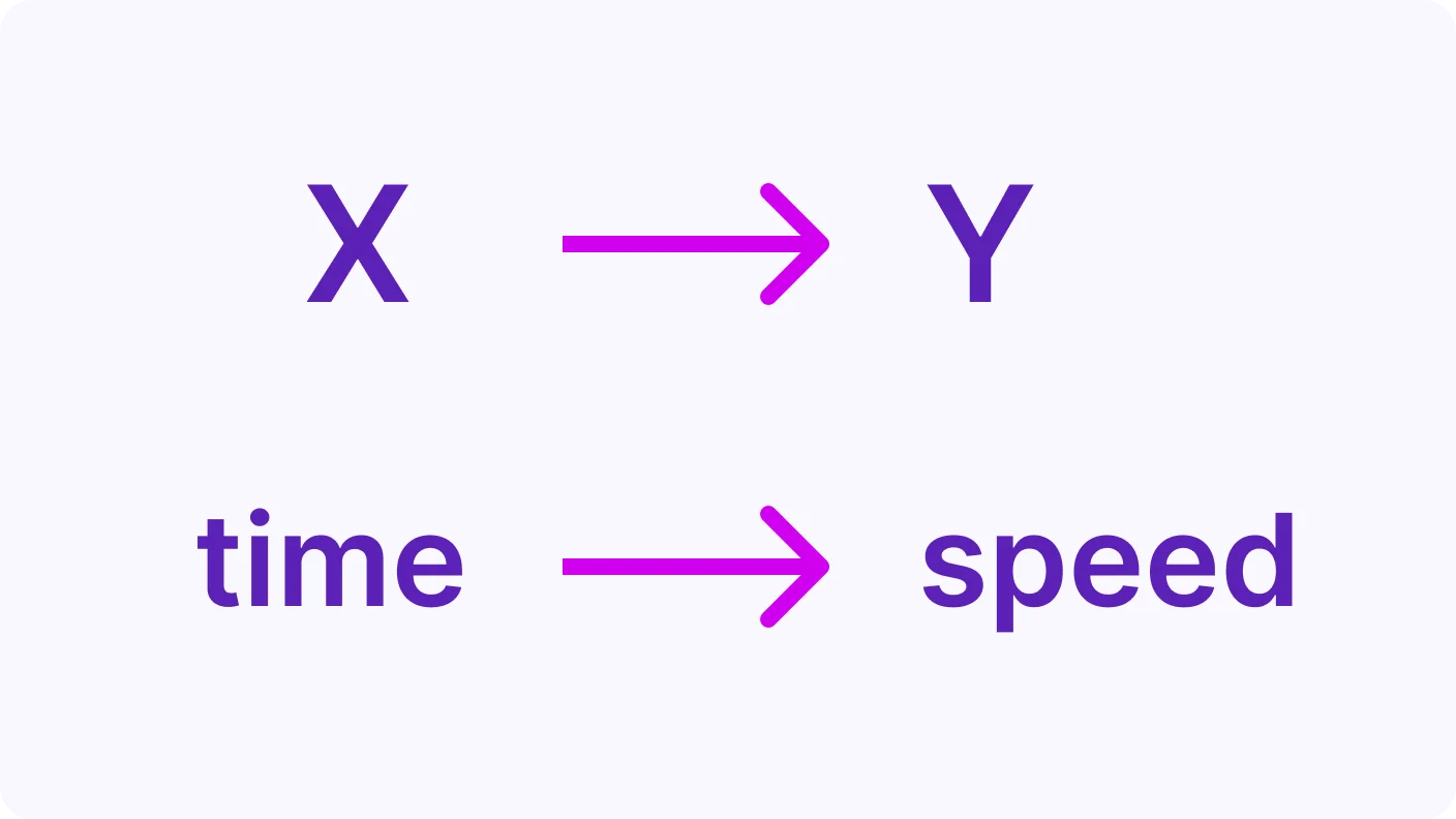
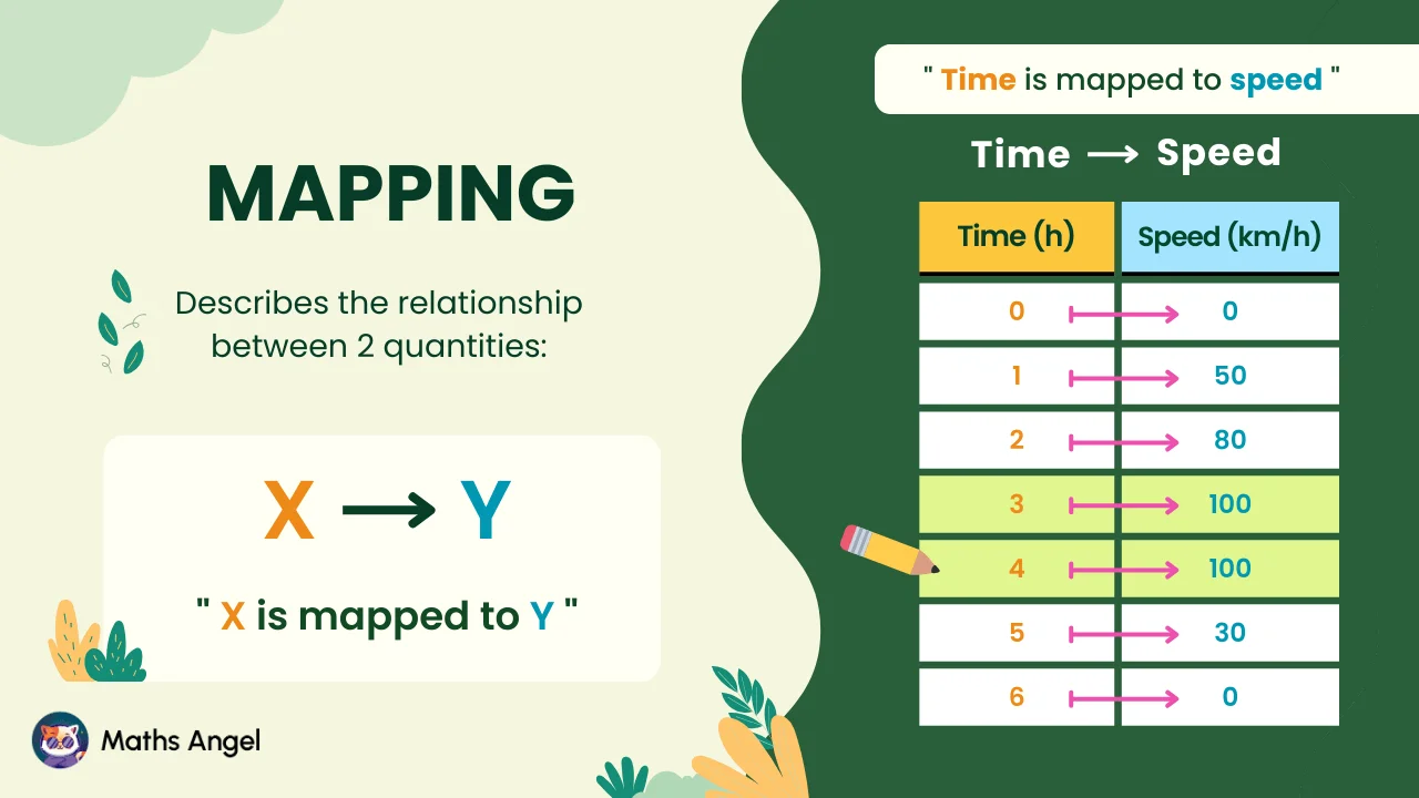
- A mapping shows how one value links to another value. We say X is mapped to Y using an arrow.
- For example, time is mapped to speed, so each time value has a corresponding speed.
How to Visualise Mapping?
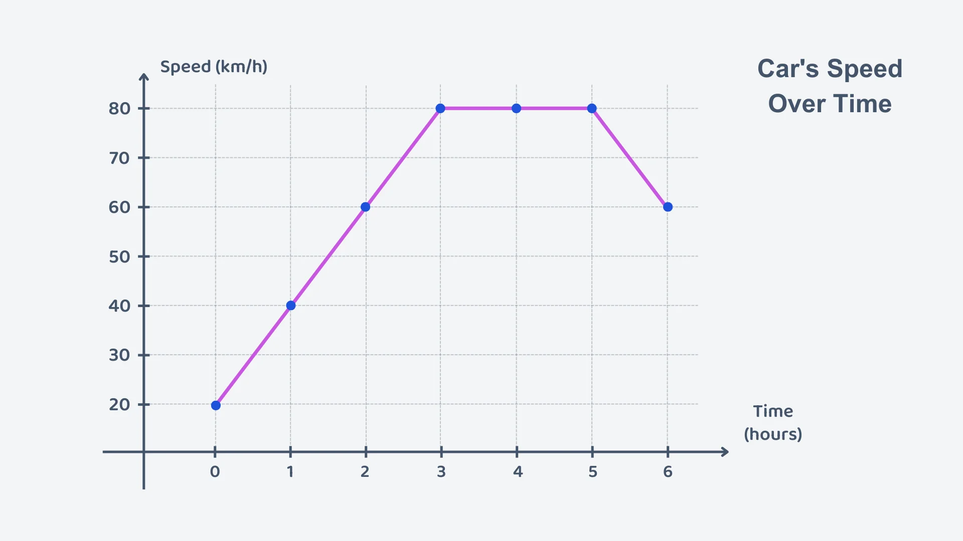
- You can use a table and a graph to visualise the mapping.
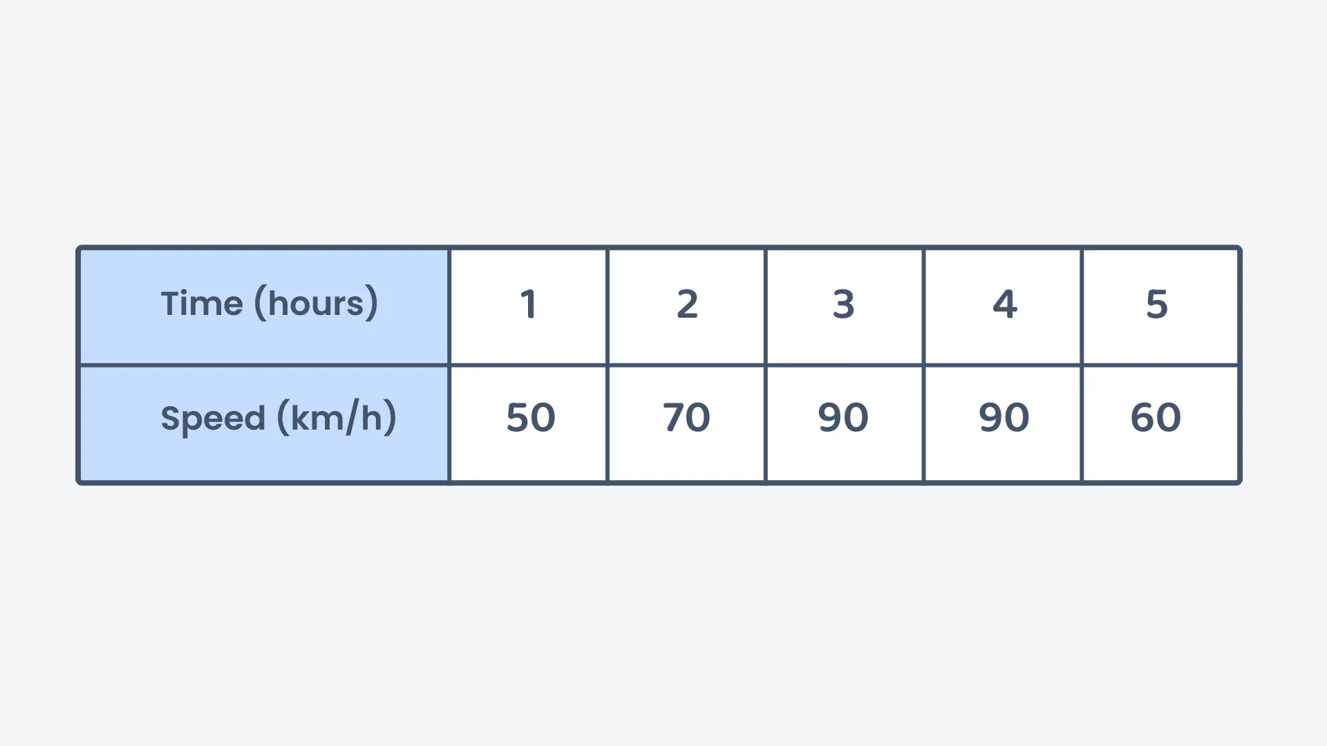
- A table shows exactly which X value matches each Y value.
- A graph shows visually how Y changes when X changes.
Using Mappings in Real Life
- Categories, such as types of balls, can be mapped to weights.
- Each input and its corresponding output can be shown in a table or graph.
- When the input is discrete categories, you should not join the points with a line.
Practice Questions
Test your understanding
If the time (hours) is mapped to speed (km/h), which is the input quantity?
Correct! 🎉 +10 pointsNot quite right
Time is the input quantity, and speed is the output quantity in this mapping.
Which of the following is an example of a mapping?
Correct! 🎉 +10 pointsNot quite right
Mapping describes the relationship between two quantities, so all of these are examples of mappings.
Which of the following should not be represented by a connected line on a graph?
Correct! 🎉 +20 pointsNot quite right
The weights of different types of balls should not be connected by a line because they represent distinct, unrelated categories.
After 3 hours of driving, the car's speed was /h. What does this mean in mapping terms?
Correct! 🎉 +20 pointsNot quite right
In mapping, time is the independent variable (input), and speed is the dependent variable (output). For this example, the input 3 is mapped to the output /h.
The graph of a car's speed shows a flat horizontal line between the 3rd and 5th hours. What does this mean?
Correct! 🎉 +20 pointsNot quite right
A flat horizontal line on a speed-time graph indicates that the car maintained a constant speed.
A table shows hours and speeds. Which statement is true?
Correct! 🎉 +30 pointsNot quite right
The speed increased for the first 3 hours, stayed constant between 3 and 4 hours, and then decreased in the 5th hour.
Want to see the full working?
Interactive Activity
Understand mapping concepts with real-life examples
Loading interactive widget...
Students Also Ask
The questions students bump into most on this topic
A mapping links each input quantity to an output quantity, describing the relationship between two quantities. For example, on a car journey, time is mapped to speed, so each hour has a speed associated with it. You can show a mapping using an arrow, a table, or a graph.
You can show a mapping in three ways. Use an arrow from the input to the output, a table of values, or a graph. A table displays the exact values, while a graph makes it easier to compare values and spot tendencies over time.
Yes. In a mapping, the same output can be associated with different inputs, and this is not a problem. For example, a car's speed is 100 km/h after 3 hours and still 100 km/h after 4 hours. Two different times then map to the same speed.
Connect the points only when the input is a continuous quantity, such as time. Joining the points with a line then shows how the output changed. When the inputs are distinct, separate categories, such as different types of balls, you should not connect them.
Both a table and a graph show the output associated with each input. A table directly displays the exact values, while a graph makes visual comparison easier. For example, on a graph the highest point shows that basketballs are the heaviest ball, weighing 600 grams.
The arrow shows the direction of the mapping. It points from the input to the output, so for a car journey it points from time to speed. We say that time is mapped to speed, which means each time has a speed associated with it.