Line Graphs and Curve Graphs
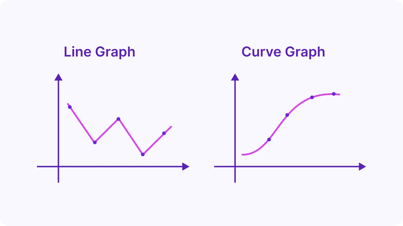
A line graph joins data points with straight lines to show how a value changes over time. You read up from the x-axis, then across to the y-axis. A curve graph instead uses one smooth curve when the relationship is not linear.
Video Lesson
Watch and learn the basics
🎬 Did this video explain it clearly?
Flashcards
Review key concepts visually
%20Line%20Graph%20from%20a%20Data%20table.webp)
%20Interpreting%20a%20Line%20Graph.webp)
%20When%20Curve%20Graphs%20are%20More%20Appropriate.webp)
%20Line%20vs%20Curve%20Graphs.webp)
How to Draw a Line Graph?
- Plot each pair of values from a table as a dot on the graph.
- Join neighbouring dots with straight lines.
How to Read a Line Graph?
- Use the x-axis to find the input (the input is often time).
- Read across to the line, then down the y-axis to find the output.
When to Use a Curve Graph?
- Use a curve when the relationship is not linear.
- Fit the data points with one smooth curve.
Line Graphs vs. Curve Graphs
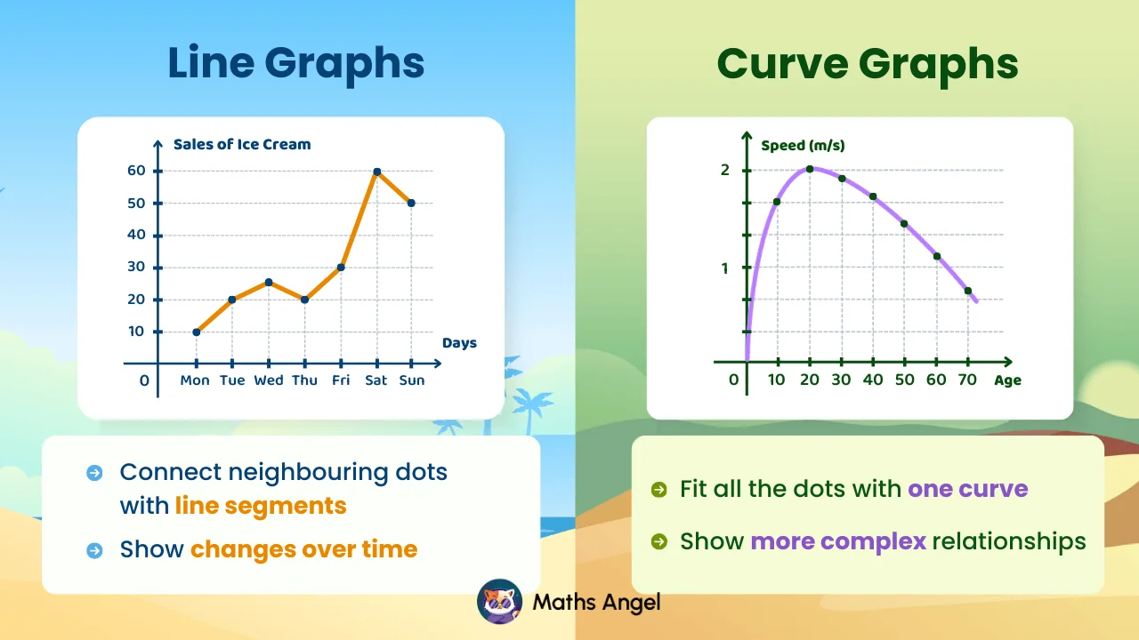
- Line graphs use straight lines to show changes over time.
- Curve graphs use one smooth curve for more complex relationships.
Practice Questions
Test your understanding
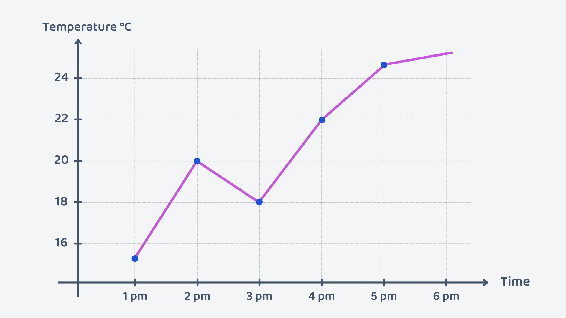
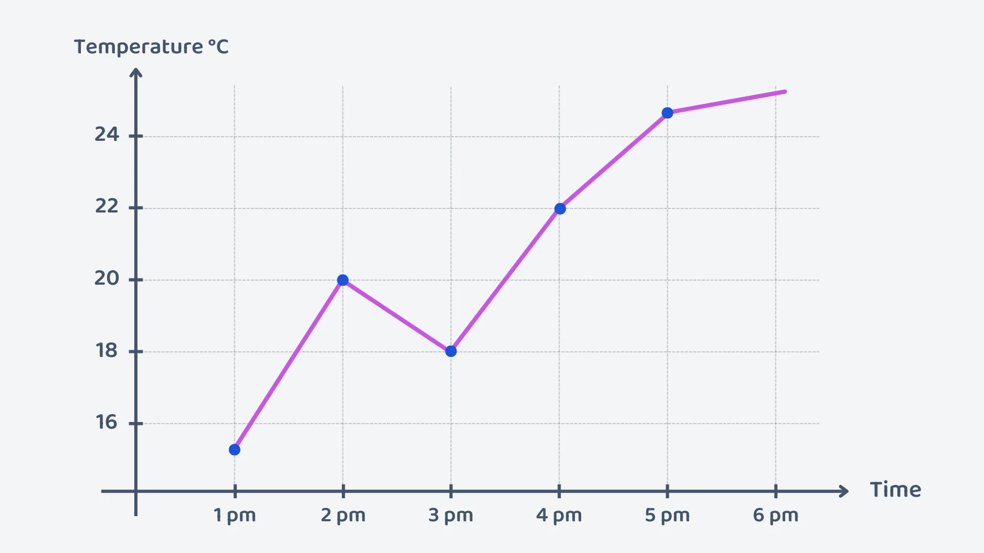
At 2 PM, what was the temperature?
Correct! 🎉 +10 pointsCorrect! 🎉 Worth 10 XPNot quite right
Find 2 pm on the horizontal (time) axis, go straight up to the plotted point, then read straight across to the vertical (temperature) axis.
The vertical scale goes up in 2s, and the point sits exactly on the line labelled 20.
So at 2 pm the temperature was C.
According to the graph, during which period did the temperature drop?
Correct! 🎉 +10 pointsCorrect! 🎉 Worth 10 XPNot quite right
Read the line from left to right and look for the section that goes downhill.
The temperature climbs from 1 pm to 2 pm, then falls from C at 2 pm to C at 3 pm, and rises again for the rest of the afternoon.
So the only drop is between 2 pm and 3 pm. The line does flatten out towards 6 pm, but a flattening line is still going up, just more slowly.
How many ice creams were sold in total from Monday to Wednesday?
Correct! 🎉 +20 pointsCorrect! 🎉 Worth 20 XPNot quite right
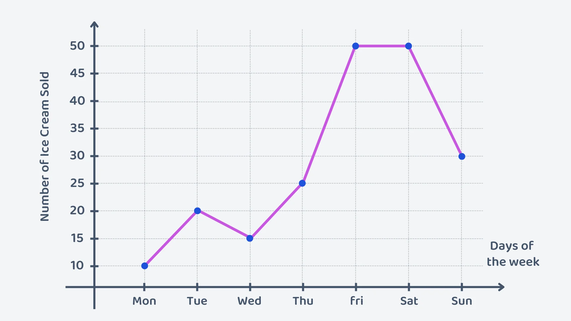
Monday, Tuesday and Wednesday are three separate points on the graph. The vertical scale goes up in 5s and starts at 10, not 0, so the three days read 10, 20 and 15 ice creams.
Adding the three days gives ice creams.
By how many ice creams did sales increase from Thursday to Friday?
Correct! 🎉 +20 pointsCorrect! 🎉 Worth 20 XPNot quite right
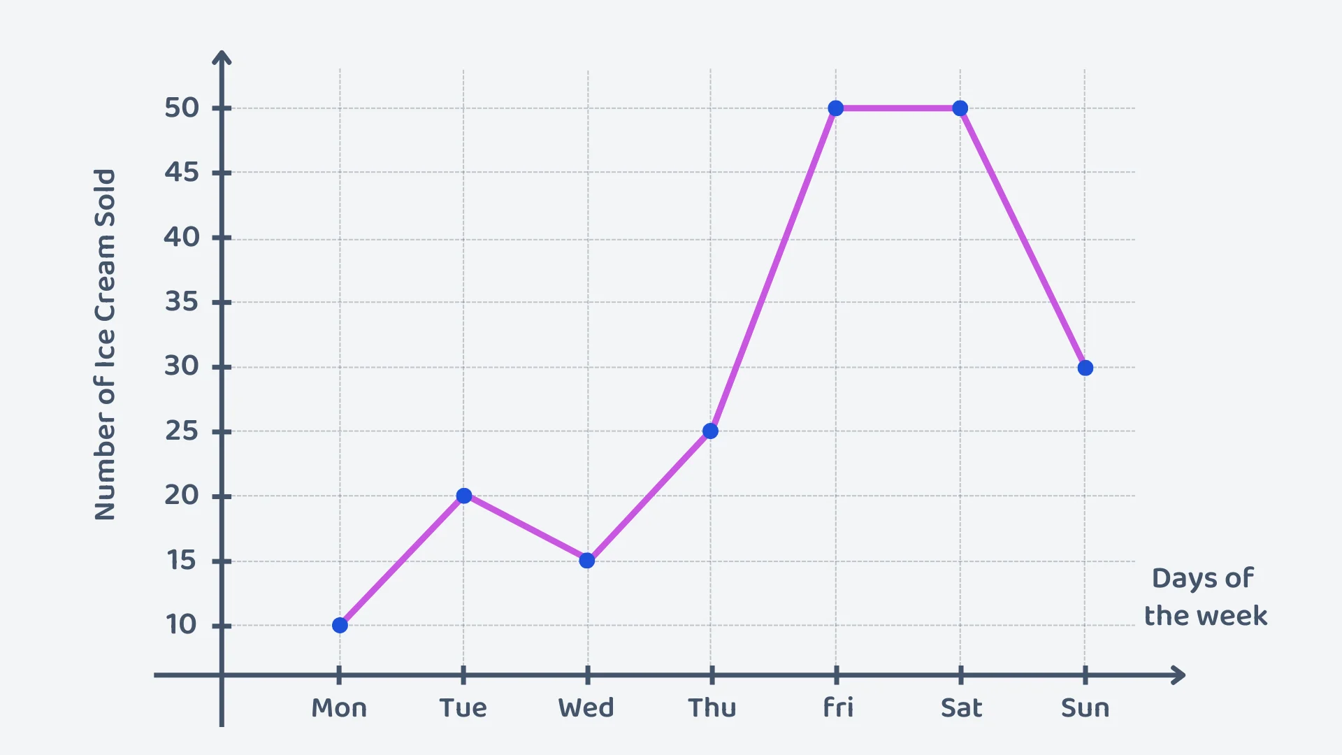
Read both points off the vertical scale, which goes up in 5s: Thursday is 25 and Friday is 50.
The increase is the difference between them: ice creams.
There are 5 steps of the scale between the two points, but each step is worth 5 ice creams, not 1.
What was the average number of ice creams sold per day over the weekend?
Correct! 🎉 +20 pointsCorrect! 🎉 Worth 20 XPNot quite right
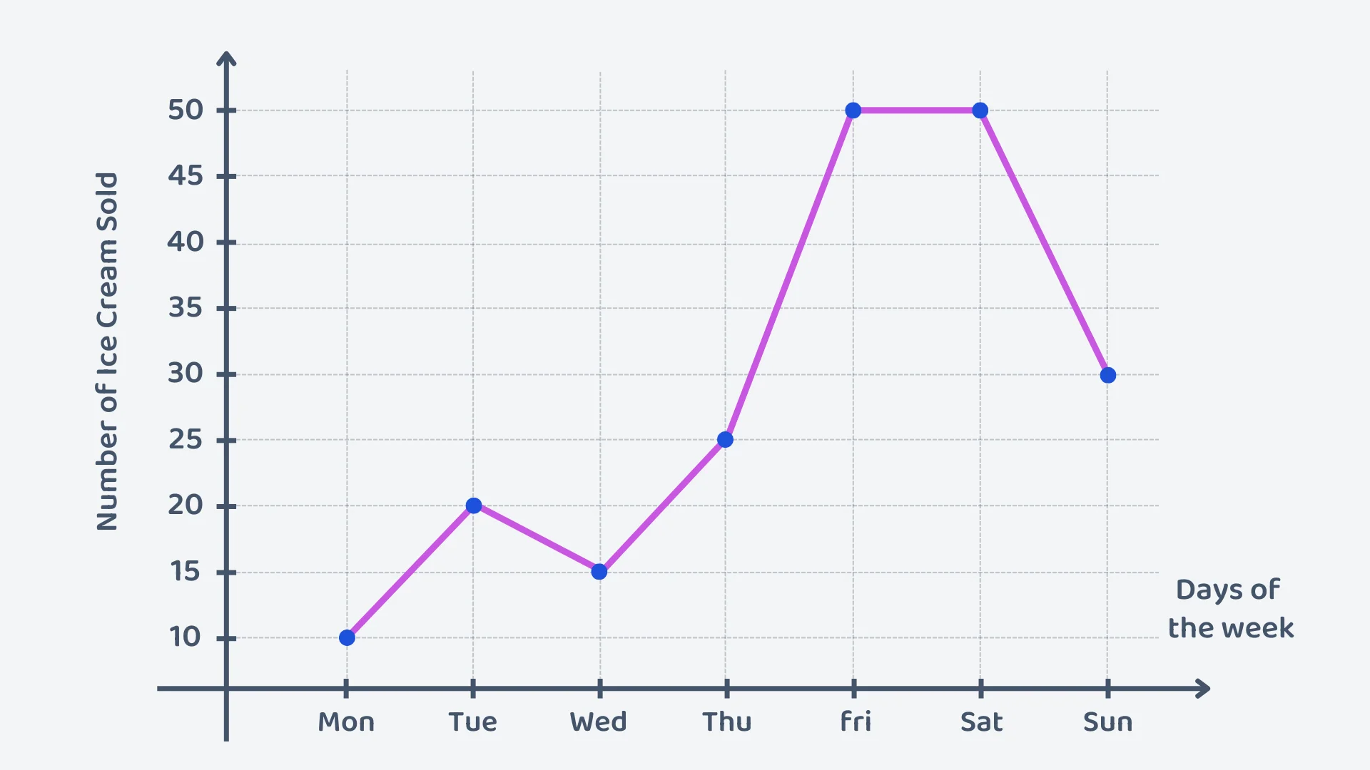
The weekend is Saturday and Sunday: 50 and 30 ice creams.
To find the mean, add the values and divide by how many days there are:
So an average of 40 ice creams were sold per day over the weekend. Note that 40 is not one of the two recorded values. A mean does not have to be.
A curve graph shows the temperature of a cup of tea over time. The curve decreases steeply at first, then flattens as it approaches room temperature. What does the flattening of the curve represent?
Correct! 🎉 +30 pointsCorrect! 🎉 Worth 30 XPNot quite right
On a temperature–time graph, the steepness of the curve shows how fast the temperature is changing, not how hot the tea is.
A steep section means the tea is losing heat quickly. As the curve flattens, the temperature is still falling, but by less and less each minute.
So the flattening shows the tea cooling more slowly as it gets close to room temperature. It never drops below room temperature, which is why the curve levels off rather than continuing down.
Want to see the full working?
Interactive Activity
Explore the difference between linear and curve graphs by interacting with the data points
Loading interactive widget...
Frequently asked questions
The questions students bump into most on this topic
A line graph plots data points and joins them with straight lines to show how something changes over time. The x-axis usually shows time, such as the hours of a day or the days of a week, and the y-axis shows what is measured, such as temperature or ice creams sold. The line makes any rise or fall easy to see.
Draw and label the two axes: time along the x-axis, the measurement up the y-axis. Choose a scale that covers all the data with equal intervals. Plot each pair of values from the table as a point, then join neighbouring points with straight lines. Finish with a title, such as “Temperature on a Winter Day”.
Check the axes and the title first, then read across and up. To find Tuesday’s ice cream sales, go up from Tuesday on the x-axis to the line, then across to the y-axis: 20. The highest point shows the biggest value, Friday’s 50. For a total, add the readings: Saturday 50 plus Sunday 30 is 80 ice creams at the weekend.
A curve graph fits the data points with one smooth curve instead of joining them with straight lines. It suits relationships that are not steady: a plant’s height over the weeks since planting rises quickly and then levels off, and a person’s running speed over their age rises to a peak and then falls.
Both show how two variables are related. A line graph joins the points with straight line segments and suits trends over time, such as daily temperature. A curve graph fits all the points with one smooth curve and suits more complex relationships, such as growth that levels off. Choose by the shape the data makes.
When the values change gradually rather than in steady steps, so a smooth curve shows the pattern better than joined straight lines. A plant growing quickly and then levelling off, or a cup of tea cooling fast at first and then slowly, both make curves. If the points sit along straight stretches, a line graph is clearer.
What's next?
Found this one hard? Go one step back first. Feeling confident? Carry on to the next lesson.