Tally Marks, Bar Charts, Tables
Tally marks count data as you collect it, grouped in fives. Bar charts then compare the groups, where each bar's height shows its value. Tables tidy the counts into rows, pairing each category with its total count.

Video Lesson
Watch and learn the basics
🎬 Did this video explain it clearly?
Flashcards
Review key concepts visually
%20Tally%20Mark%20Chart.webp)
%20Bar%20Charts.webp)
%20Tables.webp)
%20Tally%20Marks%2C%20tables%2C%20and%20Bar%20Charts.webp)
What Are Tally Mark Charts?
- Tally marks are used to count data as it is collected (e.g. number of cars passing).
- Marks are grouped in fives to make totals quicker and avoid miscounting.
How to Read a Bar Chart?
- Bar charts are used to compare amounts between groups (e.g. red cars vs blue cars).
- Read the number on the axis to find the value of each group.
What Is a Table Used For?
- Tables organise data so numbers can be read clearly and exactly.
- They save space and are useful when listing many values.
When to Use Each Type of Chart
- The same data can be shown in different formats.
- Use tally charts to collect data, tables to organise it, and bar charts to compare it.
Practice Questions
Test your understanding
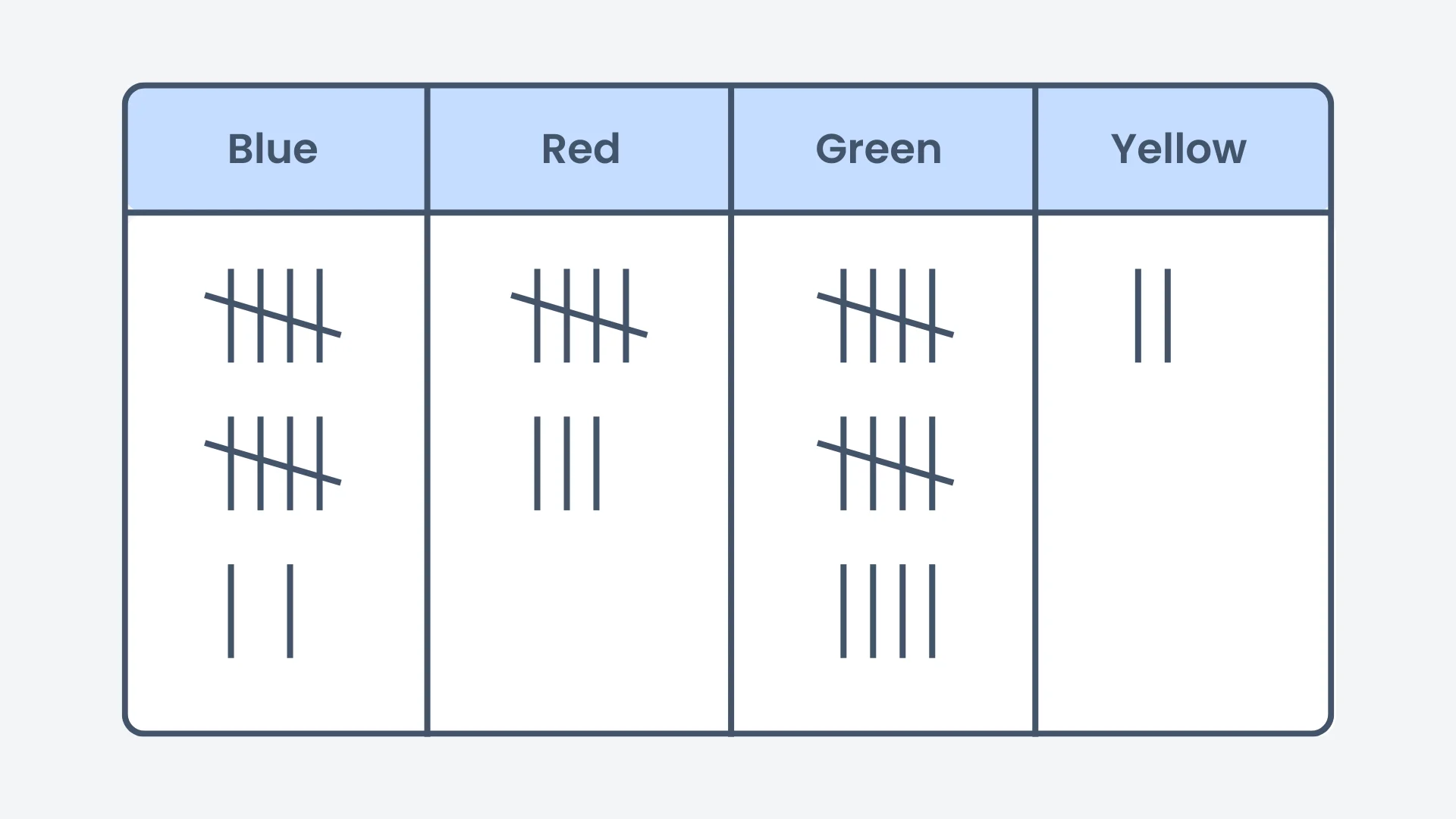
How many marbles are red?
Correct! 🎉 +10 pointsNot quite right
Counting the tally marks under Red shows there are 8 red marbles.
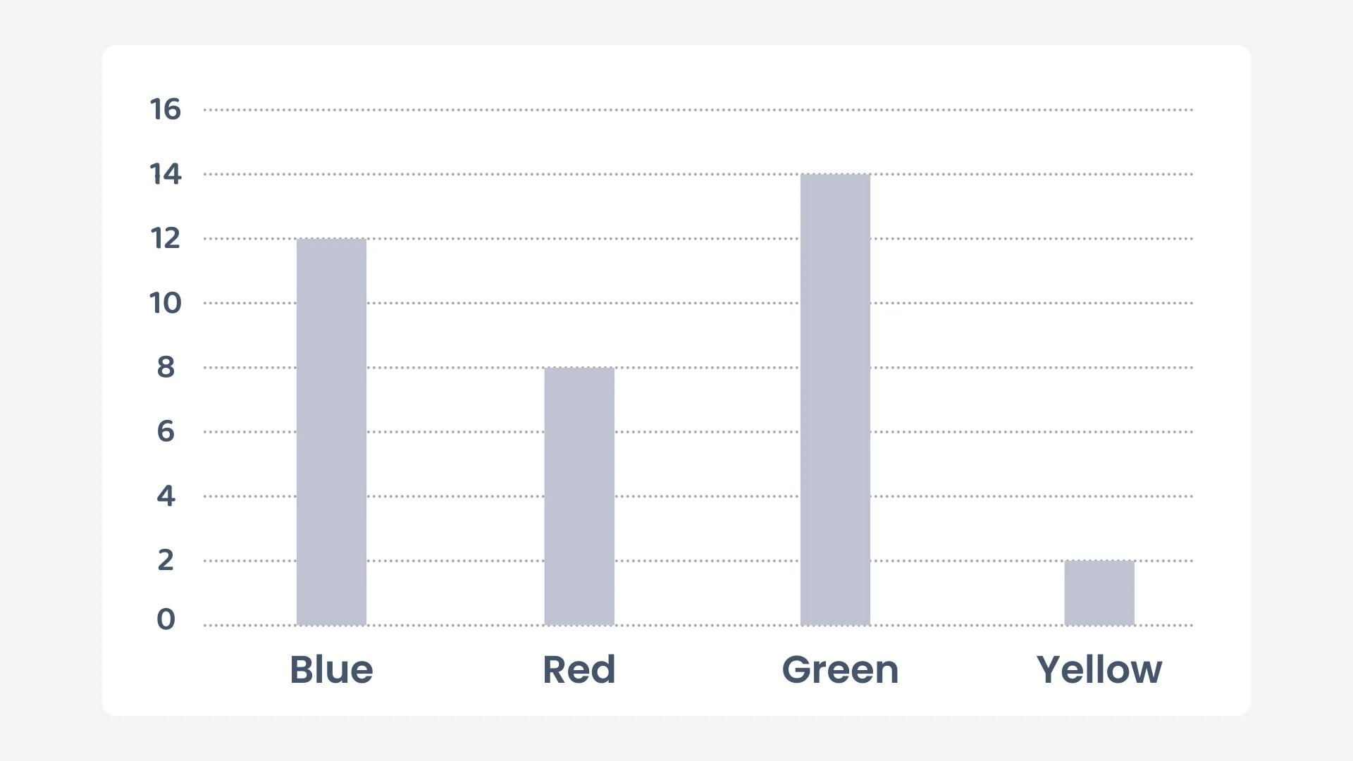
In a bar chart, what does the height of each bar represent?
Correct! 🎉 +10 pointsNot quite right
In a bar chart, the height of each bar represents the number of items counted.
How many more blue marbles did we count than yellow marbles?
Correct! 🎉 +20 pointsNot quite right
There are 12 blue marbles and 2 yellow marbles. The difference is .
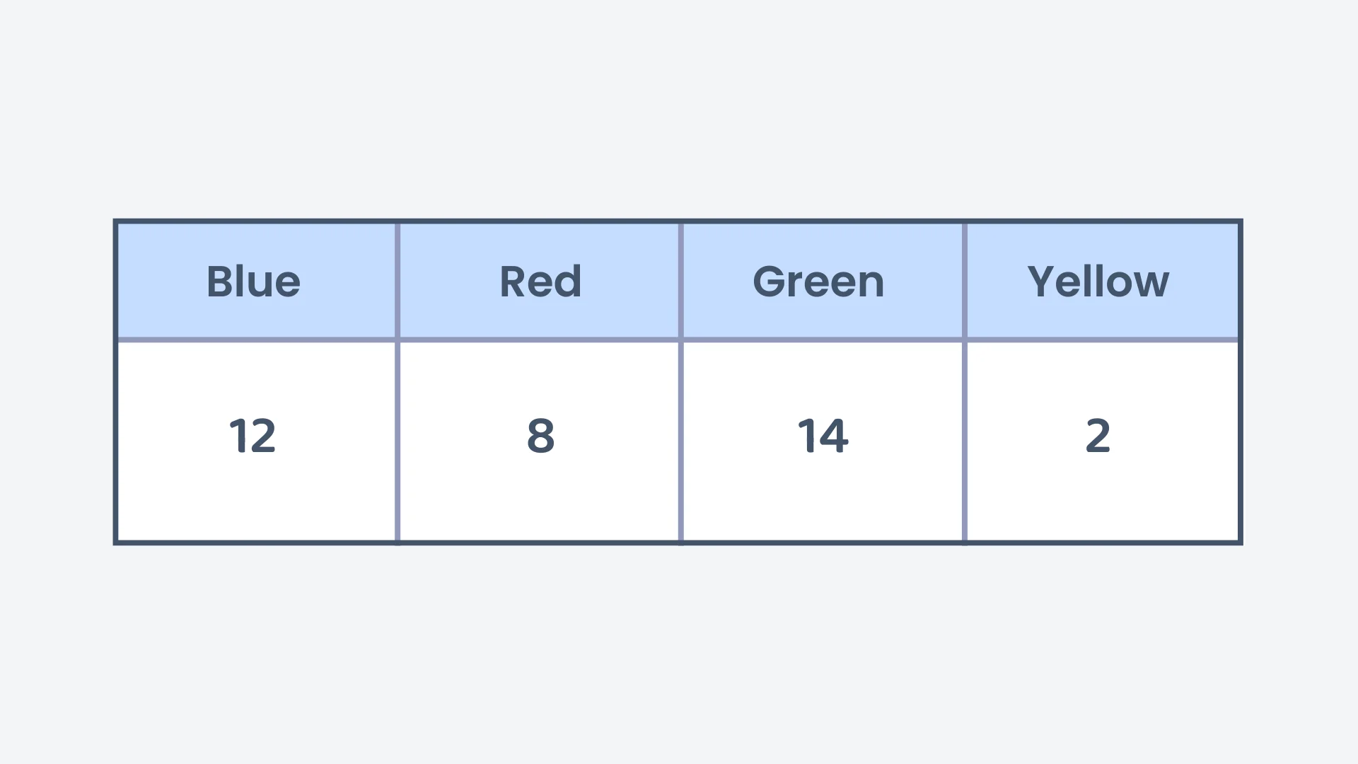
How many marbles are in total?
Correct! 🎉 +20 pointsNot quite right
Adding all the marbles gives 12 (blue) + 8 (red) + 14 (green) + 2 (yellow marbles in total.
If you want to show this data in a bar chart, which bar should be the tallest?
Correct! 🎉 +20 pointsNot quite right
The Green bar should be the tallest because it has the most marbles, with a total of 14.
Suppose there are 17 white marbles. How should you write this in tally marks?
Correct! 🎉 +30 pointsNot quite right
For 17 white marbles, you write 3 bundles of 5 tally marks (15) and 2 additional lines, making 17 in total.
Want to see the full working?
Interactive Activity
Visualise data with Tally Mark Charts, Bar Charts, and Tables
Loading interactive widget...
Students Also Ask
The questions students bump into most on this topic
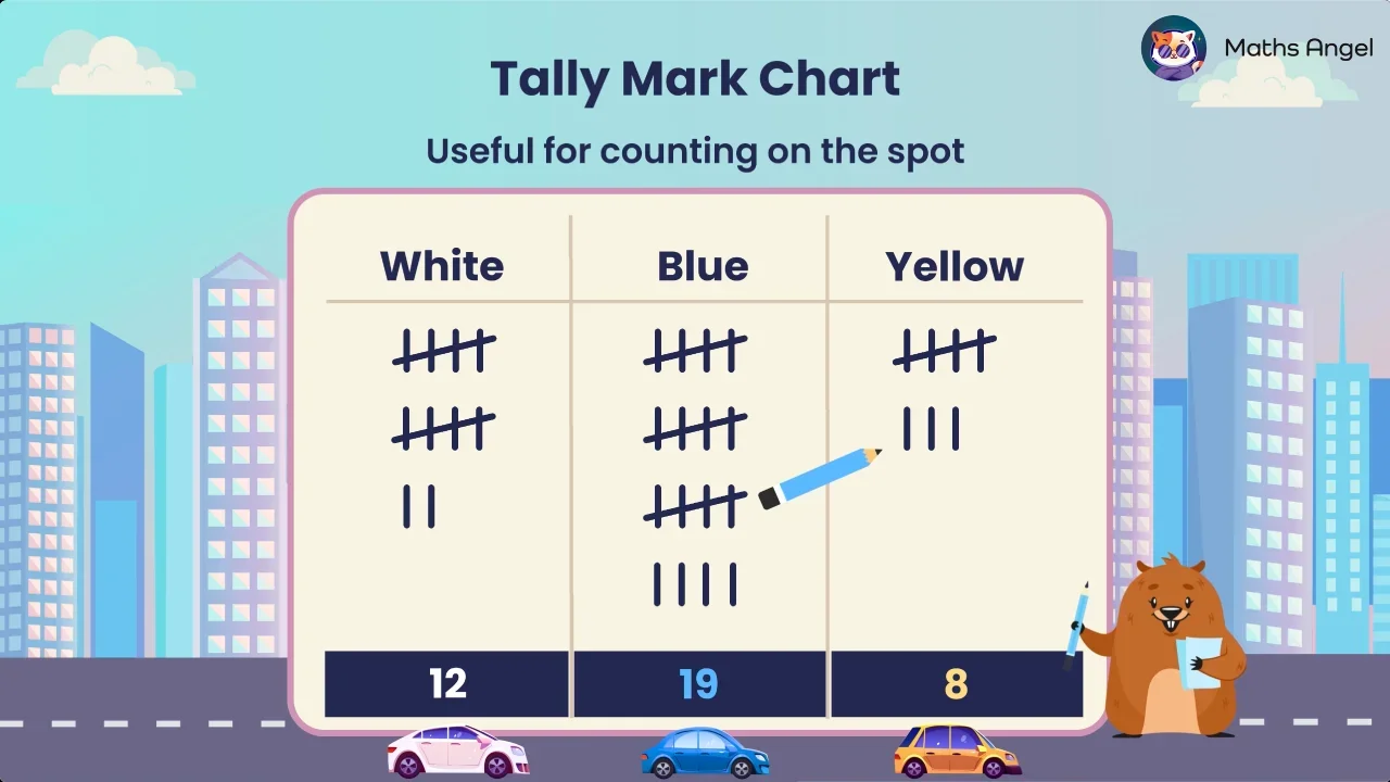
Crossing the previous four lines on every fifth mark groups your tally into bundles of five. This makes counting faster and helps prevent mistakes, because you can count the bundles in fives and then add any leftover lines instead of counting every single line.
Count how many complete bundles of five you have and multiply by five. Then add the leftover single lines. For the white cars, 2 bundles give 5 plus 5, which is 10, and 2 extra lines make a total of 12 cars.
The height of each bar shows the value for that category, so a taller bar means a larger number. On the car colours chart, the blue bar is the tallest at 19, which tells you that blue is the most popular colour.
Subtract the smaller value from the larger one to compare them. On the car colours bar chart, blue has 19 and yellow has 8, so the difference is 19 minus 8, which equals 11 cars between the most and least popular colours.
Use tally marks to count things on the spot as they happen. Use a bar chart when you want a clear visual comparison between groups. Use a table when you want a concise, space-saving summary. Each method suits a different purpose, so choose the one that fits.
A bar chart is clear, but it takes time to create and needs a lot of space. A table is simpler and more space-efficient, summarising the same information in just two columns. Choose a table when space and speed matter more than a visual comparison.